Botanical Atelier
Timeline
1 week
Role
Brand Designer
Tools
Figma, Illustrator, Photoshop
Project Overview
My mom has always been my #1 cheerleader and she’s always asking me to help her design her many side hustles.
I wanted the chance to manage a project entirely—from logo to messaging and values—with absolute creative freedom, and where better to experiment than with my #1 cheerleader’s brand?
Botanical Atelier is the invention of my mom. It is a skincare line with ingredients fully sourced from her garden and champions clean Korean skincare.
Ideation + Research
I drew inspiration from diverse skincare lines like Beauty of Joseon and Glossier—two brands renowned for their distinct design aesthetics, yet positioned at opposite ends of the spectrum. Beauty of Joseon embodies a soft, mature, and natural vibe, while Glossier is punchy, playful, and minimalist. My goal was to blend Glossier's energetic appeal with Beauty of Joseon’s refined elegance, creating a brand that resonates across a wider age range. Here were some findings from my research:
Primary colors are helpful for drawing attention
Use of photography is great, but don’t use it as a crutch to hide bad design
Negative space feels expensive when used well
Brand Values
Branding serves as a visual expression of a company's core values and beliefs. It's essential to establish clear value pillars that shape the brand’s visual identity. Here are the pillars I developed for Botanical Atelier:
Honesty and Transparency: Real ingredients for real people.
Customer Obsession: Prioritizing customers at every touchpoint, with a commitment to high-quality service and genuine care.
Sustainability: From sourcing to manufacturing and stocking, our entire supply chain is ethical and waste-free.
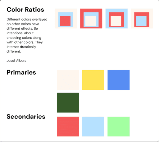
For color I was inspired by the mini documentary, The Magic of Color, which studied Josef Albers’ approach to color. He believed that colors on their own evoke completely different feelings than when they interact with one another through overlay. I took this into account when choosing my color palette.
Typography
I chose DM Sans for its inviting curves and excellent readability. However, I wanted my mom’s brand to have a typeface that would set it apart. DM Mono offered a sophisticated, timeless aesthetic, and being from the same family, it paired well with DM Sans for a cohesive yet distinctive look.
DM Sans 18pt
AaBbCc-123-Botanical
AaBbCc-123-Botanical
AaBbCc-123-Botanical
FONT
WEIGHTS
REGULAR
ITALIC
BOLD
B1-Light Italic 50px
B2-Light Italic 40px
B3-Light Italic 25px
B4-Light Italic 15px
BODY COPY
H1-Bold 50px
H2-Bold 40px
H3-Regular 31px
H4-Regular 25px
HEADLINES
H1-Bold 50px
H2-Bold 40px
H3-Regular 31px
H4-Regular 25px
HEADLINES
B1-Light Italic 50px
B2-Light Italic 40px
B3-Light Italic 25px
B4-Light Italic 15px
BODY COPY
DM Mono
AaBbCc-123-Botanical
AaBbCc-123-Botanical
AaBbCc-123-Botanical
FONT
WEIGHTS
REGULAR
ITALIC
BOLD
Logo
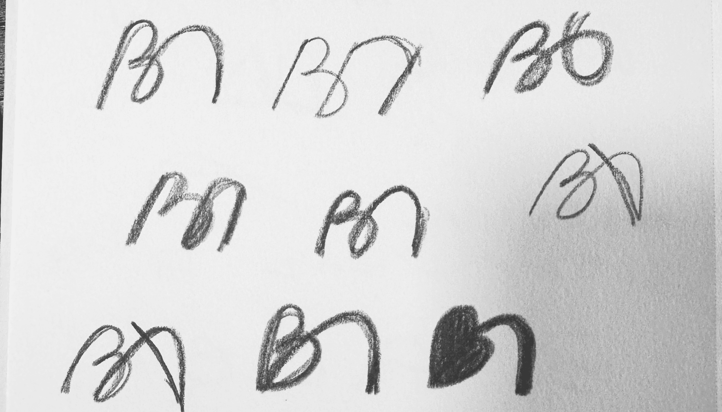
The logo needed to be both typographical and pictorial. Here were some key ideas I wanted to integrate into the logo:
Visualize the B from Botanical and A from Atelier in an abstract, seamless way
Hold to the brand values of clean beauty
Clear regardless of black and white or full color
Initial logo sketches

Logo variations and color pairings


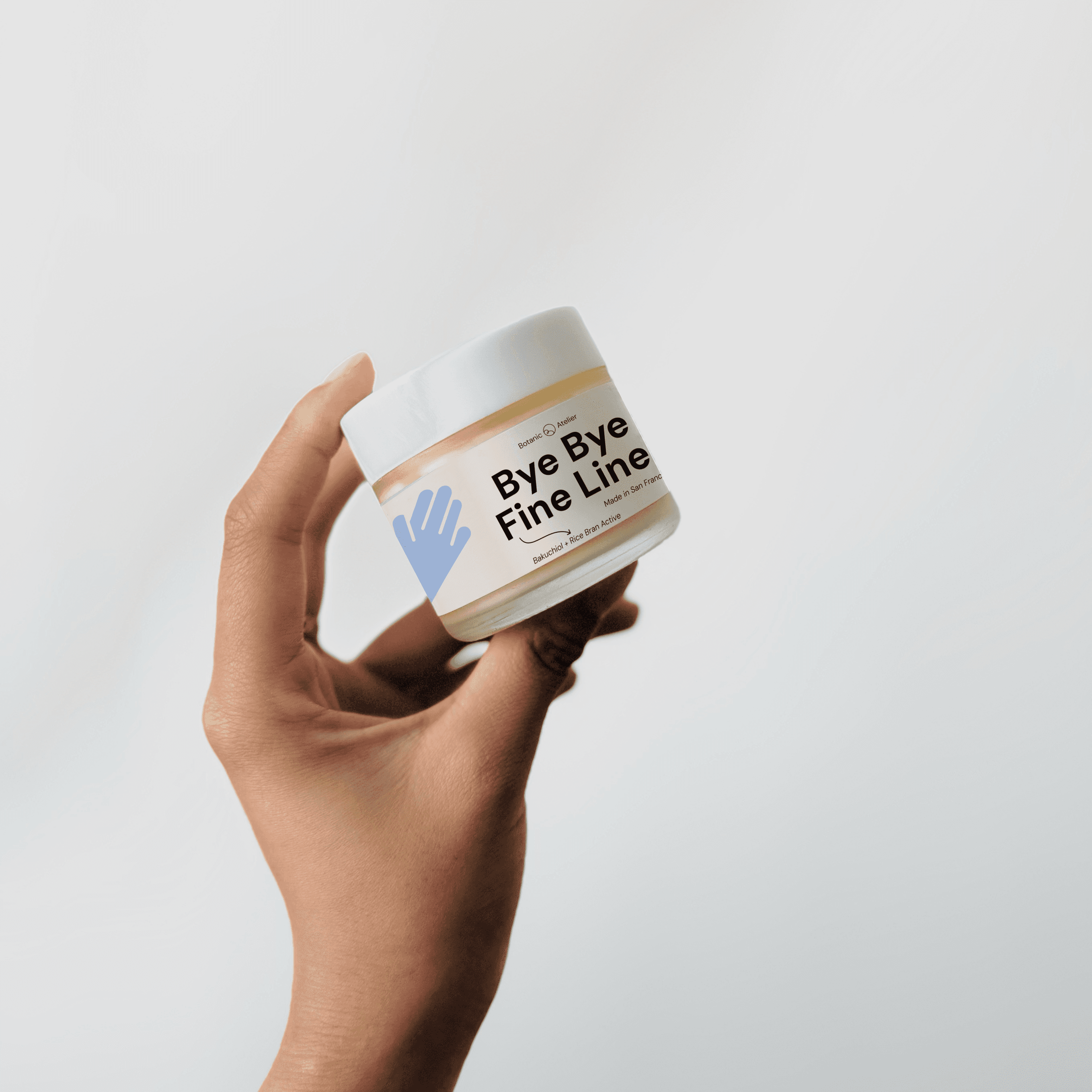
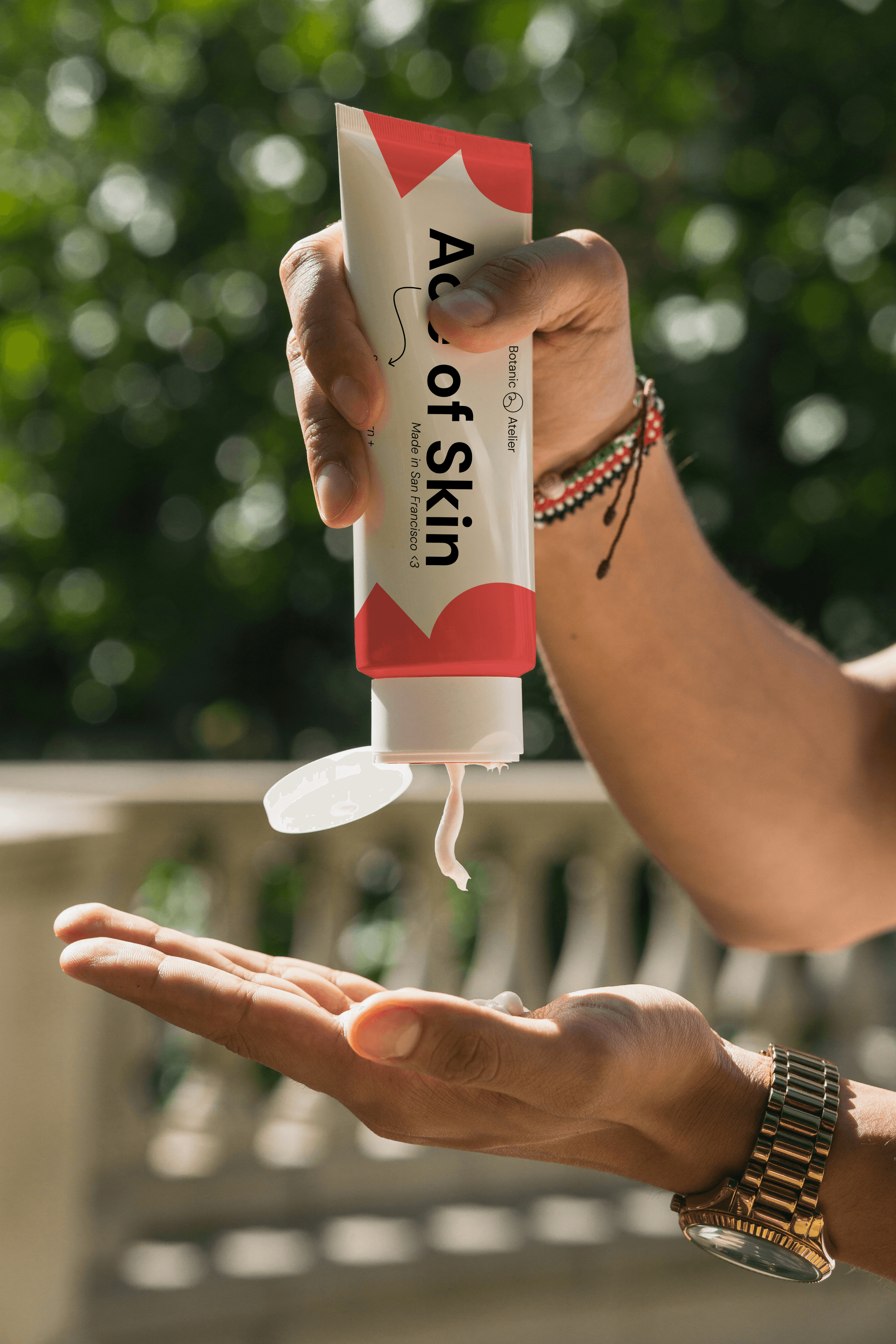
Packaging + Assets
Ace of Skin
Sea Buckthorn +
Vitamins C, A, & E
Made in San Francisco <3
Botanical
Atelier
Made in San Francisco <3
Bye Bye
Fine Lines
Bakuchiol + Rice Bran Active
Botanical
Atelier
Bye Bye Fine Lines
Bakuchiol + Rice Bran Active
Made in San Francisco <3
Botanical
Atelier
Seamless application
Rice Bran Oil
soothing + regenerate

Takeways
