brand designer @ usc
explorations

PRISMIA
Timeline
2 weeks
Role
Brand Designer
Tools
Figma, Illustrator, Photoshop
overview
Summary
Prismia is a no-code tool that allows investors to build custom sourcing and diligence pipelines.
The team needed help streamlining their design process and standardizing brand guidelines. I spearheaded a quick brand book which included a logo refresh, new color scheme, and brand do’s and don’ts.
overview
Solution
I collaborated closely with CEO Charlie Geraci to create a comprehensive brand book tailored for his team’s upcoming presentations and investor pitches. With a tight turnaround, we prioritized efficiency in each iteration, ensuring high quality and meticulous attention to detail.
Over a focused two-week period, I delivered a cohesive brand guideline that resonated with Prismia’s values and identity. The client sought a fresh, approachable aesthetic that remained professional and timeless, and the final product achieved just that.
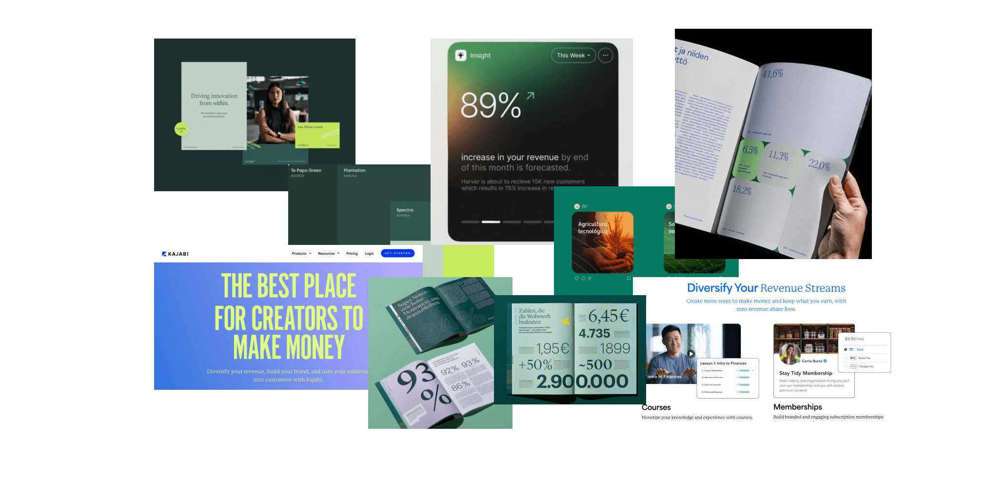
I began with a quick moodboard to help the client visualize their idea
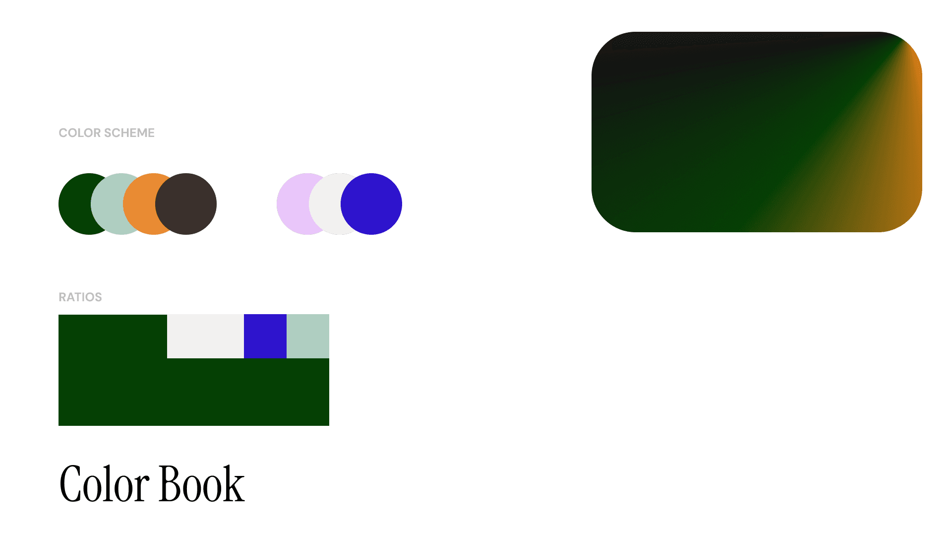
I then filtered the moodboard into an initial color scheme
Strategy
Color
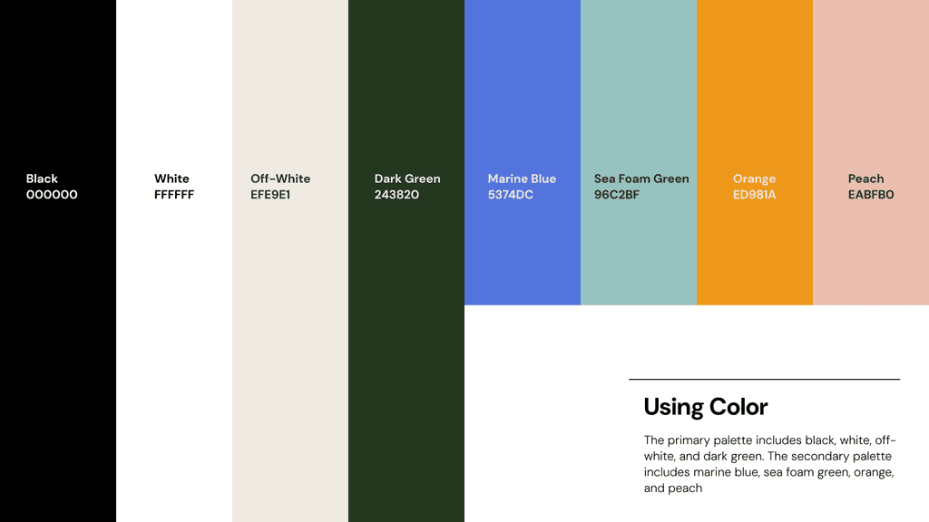
Green emerged as the perfect hero color, capturing Prismia’s tone and identity with precision: fresh, straightforward, and visually calming.
For secondary colors, the client wanted to maintain that natural, organic feel. I selected Marine Blue and Sea Foam Green, allowing Prismia Green to remain the primary focal point. Lighter shades of Orange and Peach add versatility, ideal for backgrounds and overlays that complement Prismia Green without overpowering it.
strategy
Logo
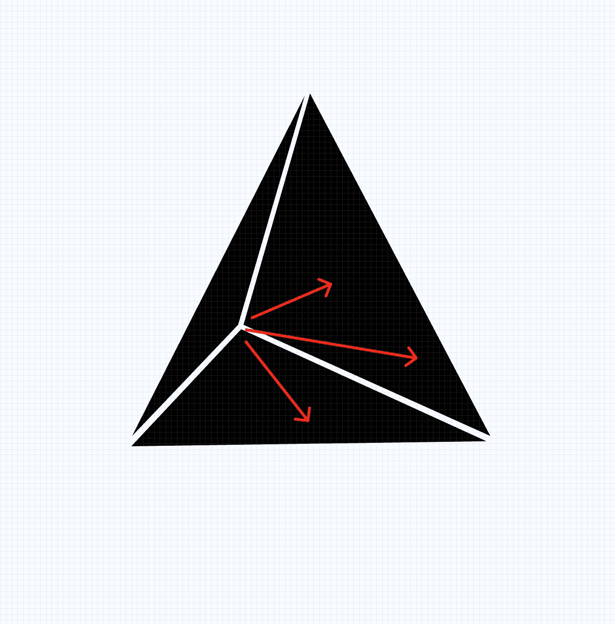
Prismia already had a logo but the client wanted a refresh. I noticed a lot of problems with the original logo:
The negative space was too thin and appeared flimsy when zoomed out
The attention was being drawn to the left rather than left towards the word mark
The fully colored-in triangles were too optically heavy
There was no symmetry and little balance
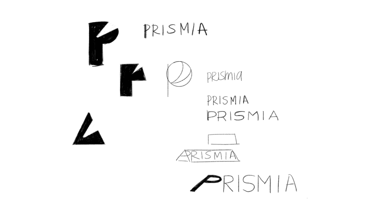
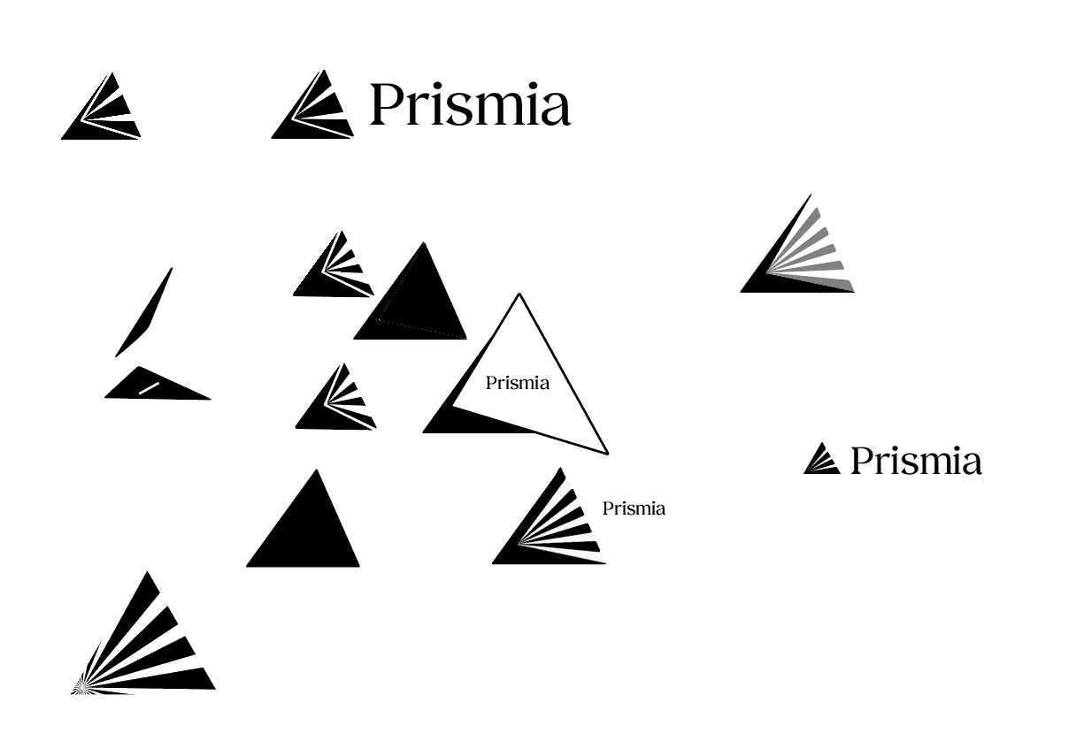
I began with pencil and paper, exploring completely other ideas, but ended up going back to the original logo to innovate on the triangle.
→
I addressed the issues mentioned above. Added symmetry, broke up the heavy weight, added more negative space, and clarified the direction of attention.
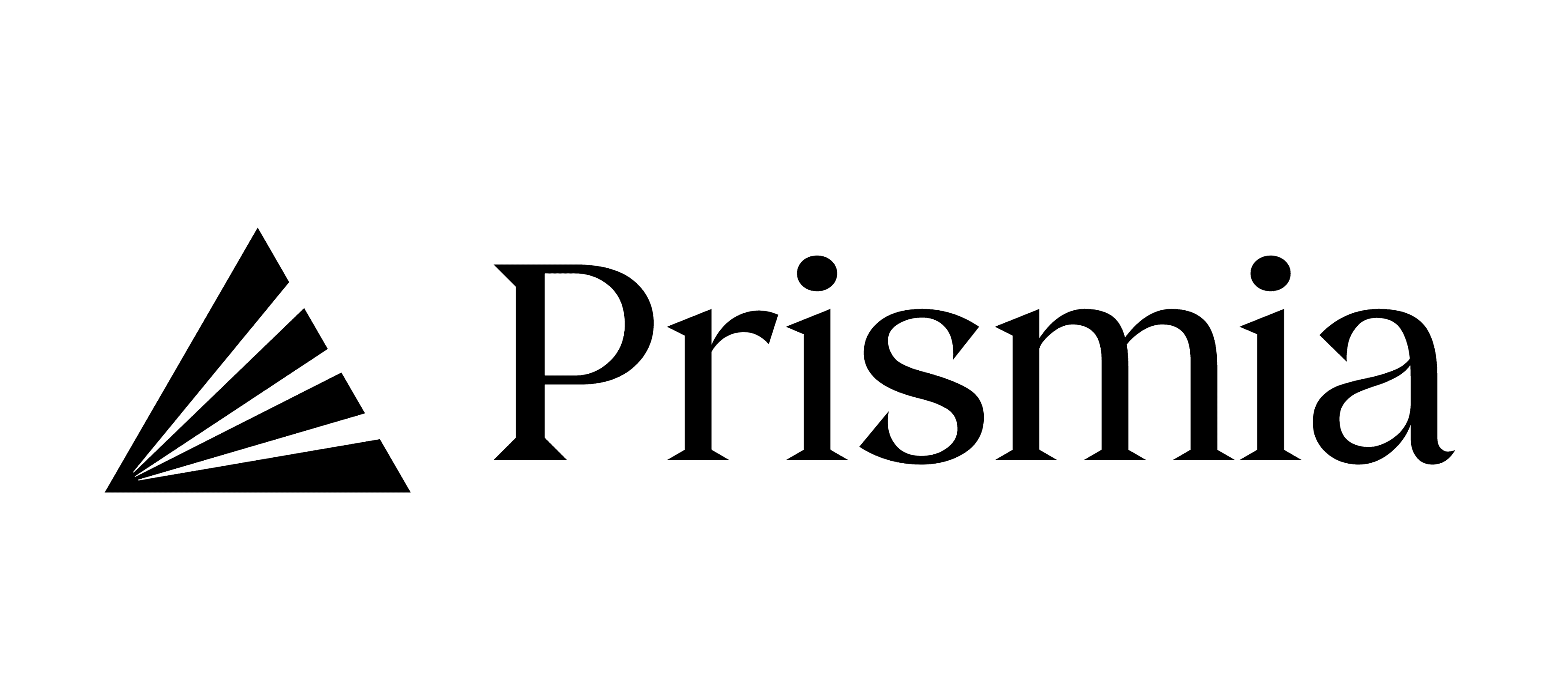
Finalized the logo with a word mark to the right of the pictoral logo.
The triangle represented a prism which refracts one source of light into many paths of color. This aligned with Prismia’s values of streamlining a disorganized process into a few efficient and orderly processes.
strategy
Typography
We wanted to walk the line between innovation and professionalism when making typographical decisions. Because the client wanted to utilize gradients, I suggested a serif header font to balance the modern designs and a sans serif body font for a contemporary tone and easy legibility.
FONT
WEIGHTS
REGULAR
BOLD
EXTRA LIGHT
HEADLINES
H1-Bold 50px
H2-Bold 40px
H3-Regular 31px
H4-Regular 25px
FONT
Instrument Serif
AaBbCc-123-prismia
AaBbCc-123-prismia
HEADLINES
H1-Regular 50px
H2-Regular 40px
H3-Regular 31px
H4-Regular 25px
Space Grotesk and Instrument Serif were two fonts I pitched which did not make the cut. Space Grotesk had a stark contrast as well as a low readability while Instrument Serif felt too compact and light for our header copy.
DM Sans was a font chosen for its easy rounded lines and even kerning while Kokoro embodied the Prismia triangle through its serifs and had dynamic letter weights.
Final DELIVERABLE
Mockups and Deliverables
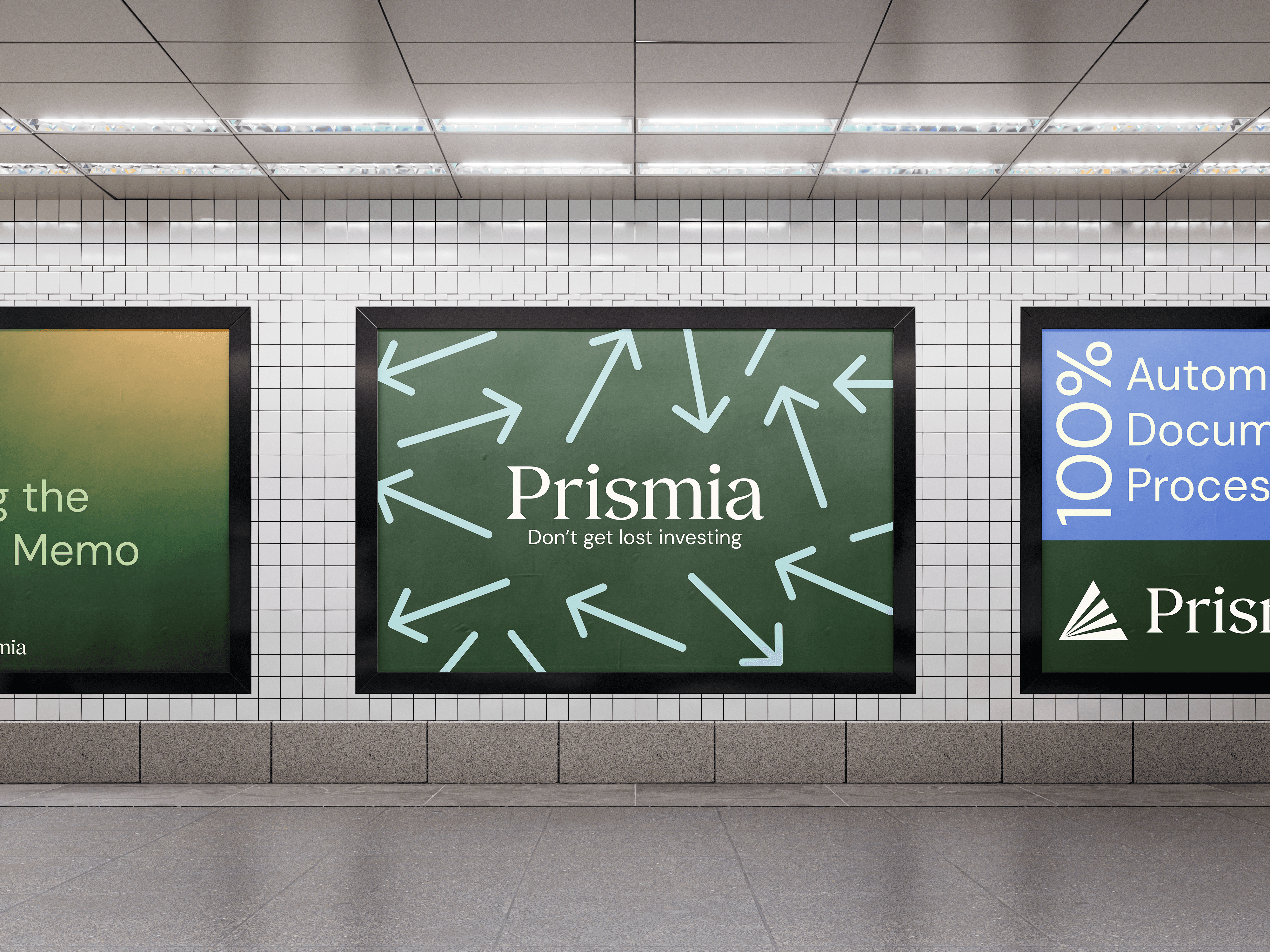
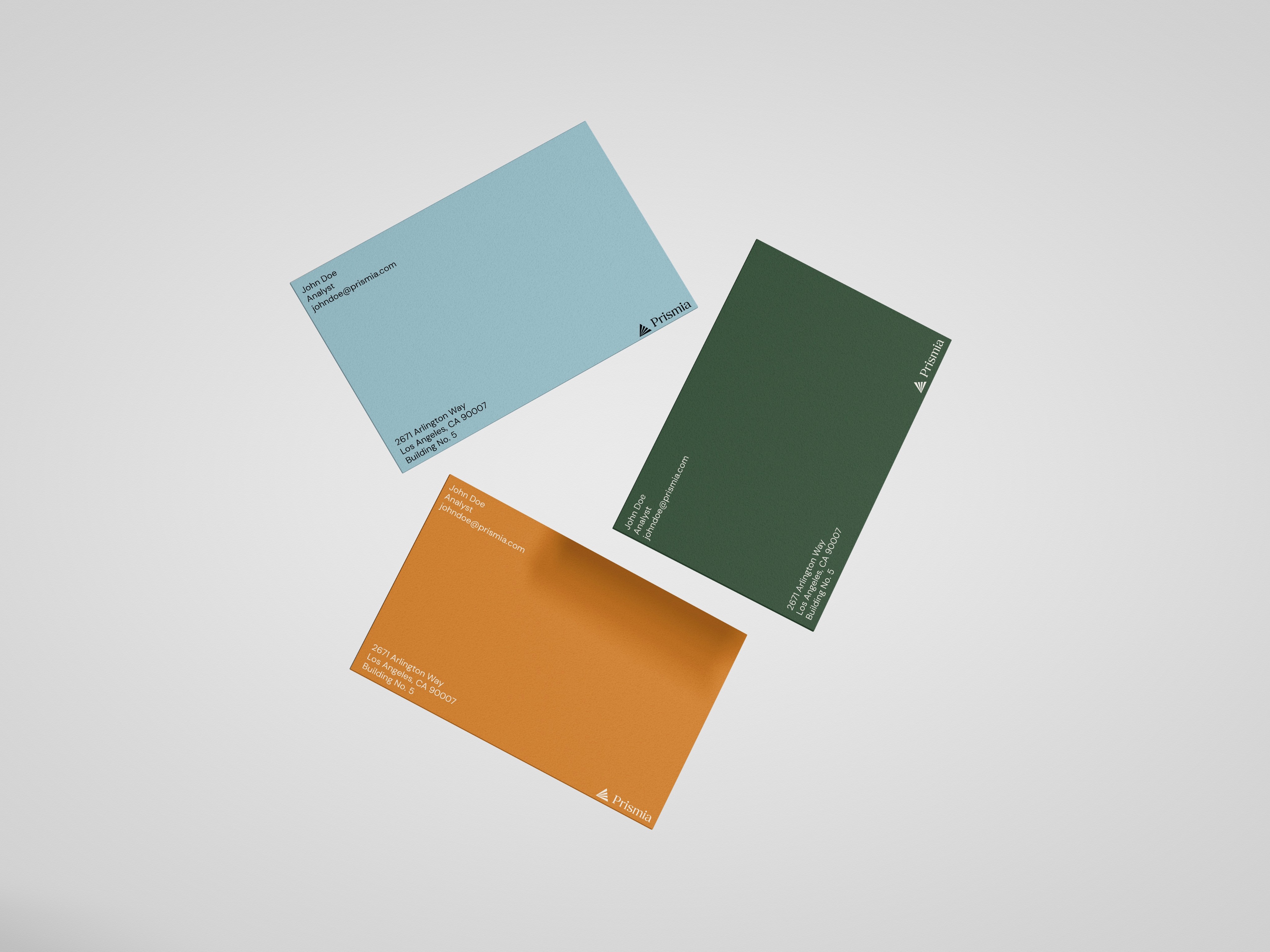
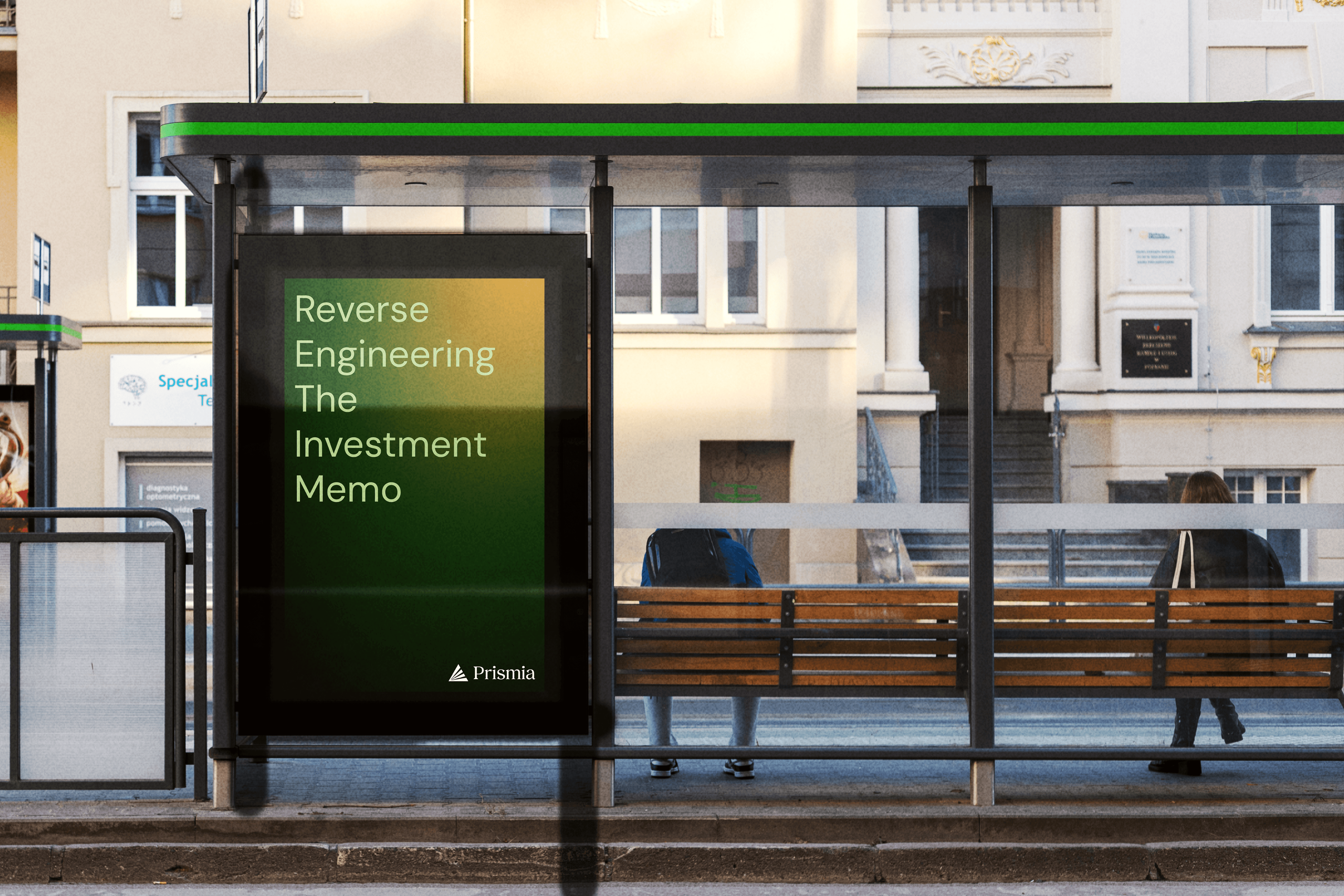
I placed logos, colors, and type into a finalized brand book while also creating mockups to help the client visualize the branding in use.
Final solution
Takeaways
Effective communication is essential in client work. Keeping the customer informed with updates on iterations, new ideas, and project progress fosters healthy dialogue and brainstorming. Equally important, though, is safeguarding your own time. Setting boundaries helps maintain a clear work-life balance, preventing burnout and overextension. My work with Prismia taught me how to freelance efficiently while respecting my own schedule.
